Foundation Dental Alliance
Rebuilding a four-brand dental consulting platform, and the analytics deck to run it, in one deadline-driven sprint
The Situation
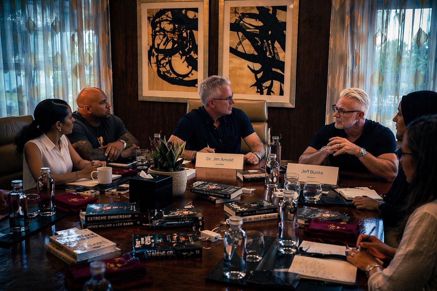
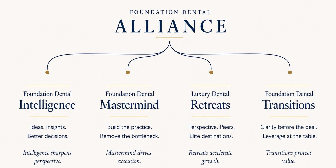
Dr. Jim Arnold spent thirty years building, losing, and rebuilding a dental practice group: the kind of career that leaves you with real scar tissue and a genuine desire to help other dentists avoid the mistakes that cost him seven figures. Out of that came Foundation Dental Alliance, four distinct offerings under one banner:
- Mastermind, an application-only peer group for practice owners
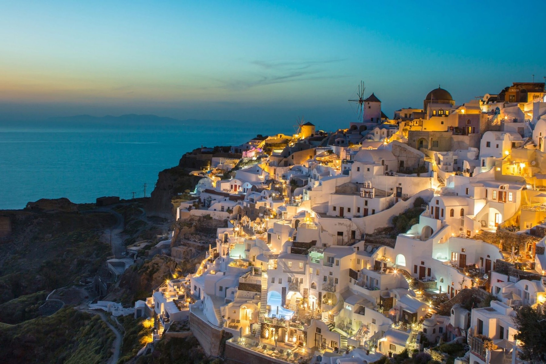
- Retreats, destination CE retreats (Santorini, Dubai, Puerto Vallarta)
- Transitions, advisory for buying, selling, and exiting a practice
- Intelligence, the publishing arm: podcast, newsletter, blog
The site meant to hold all of that together was stuck. The developer building it in WordPress had to step away mid-project, leaving a half-finished shell, not something you could hand to a prospect, and definitely not something you could point to from a conference stage. Conference season was closing in fast. Jim needed a live site, not a mockup, not a "coming soon," something that could carry the full journey from "I saw you speak" to "I applied."
That was the actual brief: not "design us something," but "get us off the ground we're stuck on, and don't lose what already works."
The Constraint
Most projects start with a blank page and a client willing to be led. This one didn't, and that turned out to be the more interesting part of the job.
Jim had a precise, hard-won sense of how each brand should look, sound, and behave. He'd lived the content for decades, and he reviewed everything personally: hero copy, corner radius, whether a headline broke onto one line or two, the exact shade a button should be before and after hover. Where I'm usually given real creative latitude, this project ran the opposite way: tight, specific, iterative, and constantly checked against his own mental image of the finished thing.
That reframes what "craft" means. The skill being tested wasn't proposing a direction and defending it. It was reading someone else's intent precisely, executing it at production quality within hours instead of days, and knowing the difference between a note worth pushing back on and one worth just doing. A tight feedback loop mattered more than a personal point of view.
In practice, that meant treating every screenshot, voice note, and marked-up render as a living spec: implement, deploy, screenshot back, adjust. Dozens of cycles a day, across four brand registers that all had to feel related without feeling identical. It's a different muscle than creative direction, closer to translation, and it's exactly the one this project asked for.
A representative sample of the kind of direction this ran on:
"Square the corners. Everywhere, not just this button."
"It needs to feel like Santorini. Not like a template with a Greek photo slapped on it."
"Good. Now do that everywhere else this shows up."
The Build
Rescue
Replaced the stalled WordPress project with a Next.js site on Vercel: fast to iterate, fast to ship, built to survive the next four brand launches, not just this one.
Mark
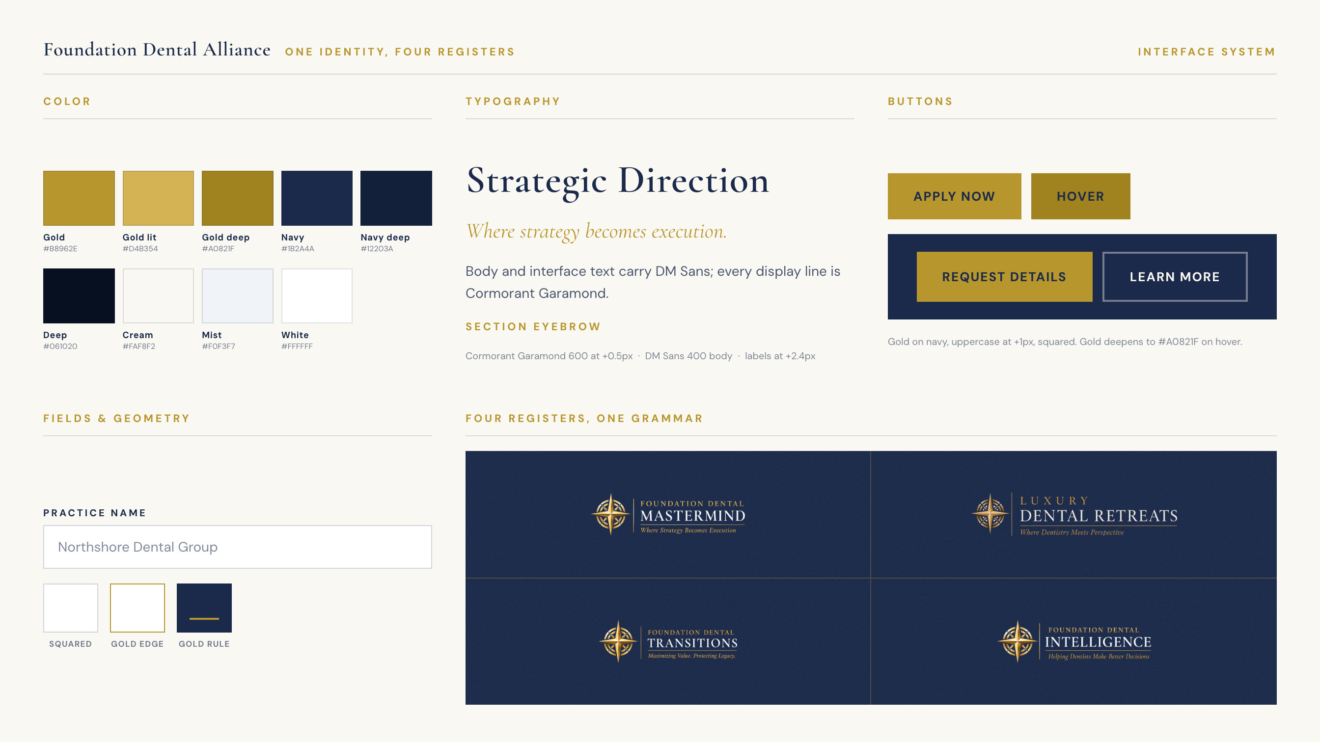
Established the compass rose and a navy / gold / cream system as the throughline across the Alliance and its four sub-brands. One identity, four distinct registers.
Build
Constructed each brand from Jim's reference renders and marked-up notes: the Mastermind application funnel, the Santorini retreat page, the Transitions advisory site, the Intelligence publishing hub. Distinct pages, one shared grammar.
Route
Untangled four separate domains sitting across old registrars and a legacy Wix host (mismatched DNS, stale forwarding rules) and landed every one cleanly on the new platform, including vanity domains that route straight to each sub-brand's own page.
Capture
Wired every entry point, Mastermind applications, retreat inquiries, newsletter sign-ups, into a real email pipeline, so a submission on launch day behaves exactly like one a year from now.
Launch
Went live across all four domains ahead of conference season, with certificates, redirects, and every form verified end to end, not just checked in preview.
Instrument
Jim's closing request: not just a live site, but a way to see it working.




Instrumentation
A live site wasn't the finish line. Jim wanted to log in and watch it work: which pages held attention, which brand was pulling traffic, whether an inquiry form actually converted into a real lead. So the platform grew a dashboard.
It's first-party, end to end: a lightweight tracking script records pageviews, scroll depth, and time-on-page without ever storing an IP address or a name. Unique visitors are counted with a probabilistic structure (a HyperLogLog) rather than raw identifiers, and the whole thing runs on Vercel with Upstash Redis behind it, so the numbers survive a redeploy instead of quietly resetting to zero. No Google Analytics, no ad trackers, no cookie banner required.
Conversions are counted where they're true: a completed form submission, not a button click, so the dashboard and Jim's inbox always agree with each other. A side nav breaks the whole site down by brand, so Mastermind, Retreats, Transitions, and Intelligence each get their own traffic, engagement, and conversion picture alongside the whole-site overview: visitors, pageviews, sessions, bounce rate, time on page, top pages, referral sources, devices, geography. The metrics an operator actually checks, not a wall of vanity numbers.
It turned "trust me, it's working" into something Jim could open on his phone between sessions at a conference and see for himself.
What Shipped
- Four sub-brand sites unified under one visual system, each with its own register
- A stalled WordPress build fully replaced, live before conference season
- Four domains migrated and routed with zero-downtime cutover
- A lead-capture pipeline wired across every form, on every brand
- A first-party, privacy-respecting analytics dashboard, permanent, and broken out per brand
Reflection
The result is a platform Jim can point to from a stage, hand to a prospect mid-conversation, and check the numbers on that same night: built to the letter of a very specific vision, and built to keep working long after the sprint that shipped it.
What this project proved, for me, wasn't a new visual trick or a clever build pattern. It was that versatility cuts both ways: being equally fluent leading a direction and following one at full fidelity. Matching someone else's stringent, specific vision at a professional bar, fast, under real deadline pressure, across four brands at once, is its own discipline, distinct from creative authorship and just as demanding. This project was that discipline, end to end.

I've worked with a lot of talented people over the past 30 years, and I can say without hesitation that Eddie is one of the best.
From the very first build package I sent him, it was obvious he was different. I gave him a detailed vision with layouts, typography, screenshots, and design direction. He came back with something that looked almost exactly like what I had in my head. In many cases, he made it even better.
What impressed me most was how he worked. He's incredibly creative, remarkably responsive, fast, accurate, and genuinely collaborative. He listens. He asks thoughtful questions. He welcomes feedback, implements changes quickly, and often anticipates what I'm looking for before I even ask.
There's a big difference between hiring a vendor and finding a true partner. Eddie has been a true partner throughout this entire project, and that's made all the difference. He genuinely cares about the finished product and takes real pride in his work.
The finished website is something I'm genuinely proud of, and Eddie deserves a tremendous amount of the credit. It's rare to find someone who combines technical skill, creativity, professionalism, and work ethic at this level.
If you're thinking about hiring Eddie, stop wondering. I recommend him without reservation. I'd hire him again in a heartbeat.